“Connected” (it was not connected)
On day one, Claude built my homepage, a passcode gate and a whole system for case studies in about three hours, with colours pulled straight from my Figma file. It also went sideways in a very modern way: the Figma plugin cheerfully reported “Connected” and then couldn’t see a single thing I selected. There are two Figma connections, it turns out, one to the cloud and one to the app on your desktop, and I had wired up the one that can’t see your desktop. The fix is still in the project notes, because it will bite again.
Five days later I opened a chat with what turned out to be the most important sentence of the project:
I’m a designer, not an engineer, so explain things in design terms rather than code. Be blunt.
It was blunt. I had drawn seven different section layouts, and it told me that underneath they were two: text beside a picture, and text above one. I’d been dressing the same two ideas in seven outfits. Those two became the building blocks of the first site, and I decided I liked blunt.
The day I wrote the AI a job description
Early on I told it to use its judgement as a senior web developer, and it did exactly that: it made six decisions on its own and told me about them afterwards.
They may well have all been right, but I had no way to tell, and that was the scary part. So I wrote the rule down: you’re the senior web developer, Figma is a guideline, and if you want to change something I didn’t ask for, tell me what you’d do and wait for a yes. It went into a file the AI reads at the start of every chat, which makes it the onboarding doc for a brilliant new hire who forgets everything overnight.
Alex is a designer, not an engineer. Explain in design terms: what a thing does and how it looks.
You are the senior web developer on this project. Alex is not going to catch a bad technical call, so don’t lean on him to. Have an opinion and say which option you’d pick and why.
Recommendations get asked about, not quietly applied. Say what it is, what breaks without it, and what you’d do. Then wait for a yes.
That file carried the whole project. I had 42 separate chats and they behaved like one long one, because each opened by reading it and most ended by adding to it. The rule held for six weeks, although on the very last day I was still reminding it that Figma is a guideline.
The web, translated into Figma
The first two weeks were a crash course in how the web gets built and shipped, the parts I’d never needed inside Meta’s setup, and I asked about all of it:
should I install homebrew? What does home brew do?
For the hero, I want to have a gif on repeat. Should I just add the gif to the chat?
what is WebGl hero?
WebGL is After Effects running live inside the page.
what does create PR mean?
The answers landed because they came in my language. CSS animation is Smart Animate; WebGL is After Effects. From there the AI talked me into a rule I loved: zero JavaScript for motion, with everything moving in plain CSS. I thought this was very cool and very principled, and I held on to it for almost a month.
We settled on one rule for every picture on the site: does the reader need to recognise it, or read it? A flow you only follow can sit small and let the caption work, but a screen whose words are the evidence needs the width. When my phone mockups came out as postage stamps, the fix was mine: “What happens if I stack them vertically?” They went from about 97 pixels wide to 380, big enough to read.
The AI wasn’t always right, but it said so when it wasn’t: “My ‘finished installing’ a moment ago was wrong.” My Mac has no video tools at all, so every clip on this site went through tiny scripts it wrote from scratch. And once I asked it a question and got an answer I hadn’t ordered:
It looks awkward because it doesn’t look left aligned. Do you think we should flip it?
flips fourteen sections
Wait revert the change
I stopped describing and started pointing
The biggest change in how I worked came from a small browser built into the Claude desktop app. You can click any element on your page and attach it to your message, so instead of typing “the third paragraph in the section about the thing,” I could click the paragraph and type “make this smaller.”
An animation of the element picker: a cursor clicks a picture on a page, the picture is outlined, a message reads "this thing, right here, smaller", and the picture shrinks.
I did that 27 times in two sessions, and then I typed the sentence that ended Figma’s career as my copy doc:
Ignore the figma now since its outdated, we are just doing updates live now
From then on the live page was the source of truth for every word. I pointed at things 91 times over the project, and it turns out “What size type is this? Can we decrease this.” is a perfectly good prompt. It was also the first hint of something I’d build a month later, once typing sentences into a chat box started to feel like dictating to a very fast typist.
A real lock, not a blurry box
Some of my case studies needed a passcode, and I wanted a real lock rather than a blurry box you can peek behind. So the protected chapters are encrypted when the site is built, the pictures inside them get random names that change with every build, and the build refuses to publish at all if the passcode is missing. The AI even caught its own gap before I did, admitting it had “encrypted the prose and left the evidence in the open,” and then closed it.
On top of that sits a check that refuses to publish any page that would leak a protected sentence onto a public page. We proved it works by sneaking leaks in on purpose and watching it catch every one, which was more fun than a security test has any right to be. My questions were the product ones:
I want to make sure the site is secure
what happens if I forget my passcode?
This was also the week I found out I have a thing about dashes: “I typically don’t use hyphens and it seems like AI slop because AI always uses it.” Every em dash on the site died that day. Five days later, all of it had to go live.
Launch #1, run by screenshot
We went live on September 1st, and it took both of us. I was the hands in GitHub, Cloudflare and the domain registrar, and the AI was the eyes, reading the screenshots I pasted in with helpful captions like “This is what it shows:” and telling me what to click next. The first deploy failed on a version mismatch I couldn’t have picked out of a lineup. Then my own security settings blocked my analytics. I had a launch to finish, so I switched analytics off, and it stayed off for four weeks.
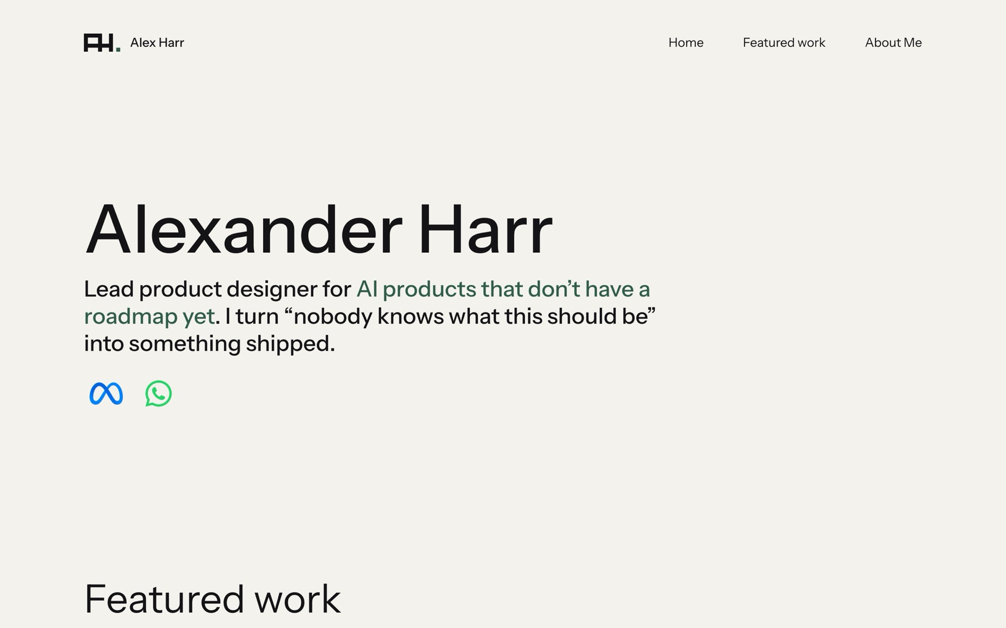
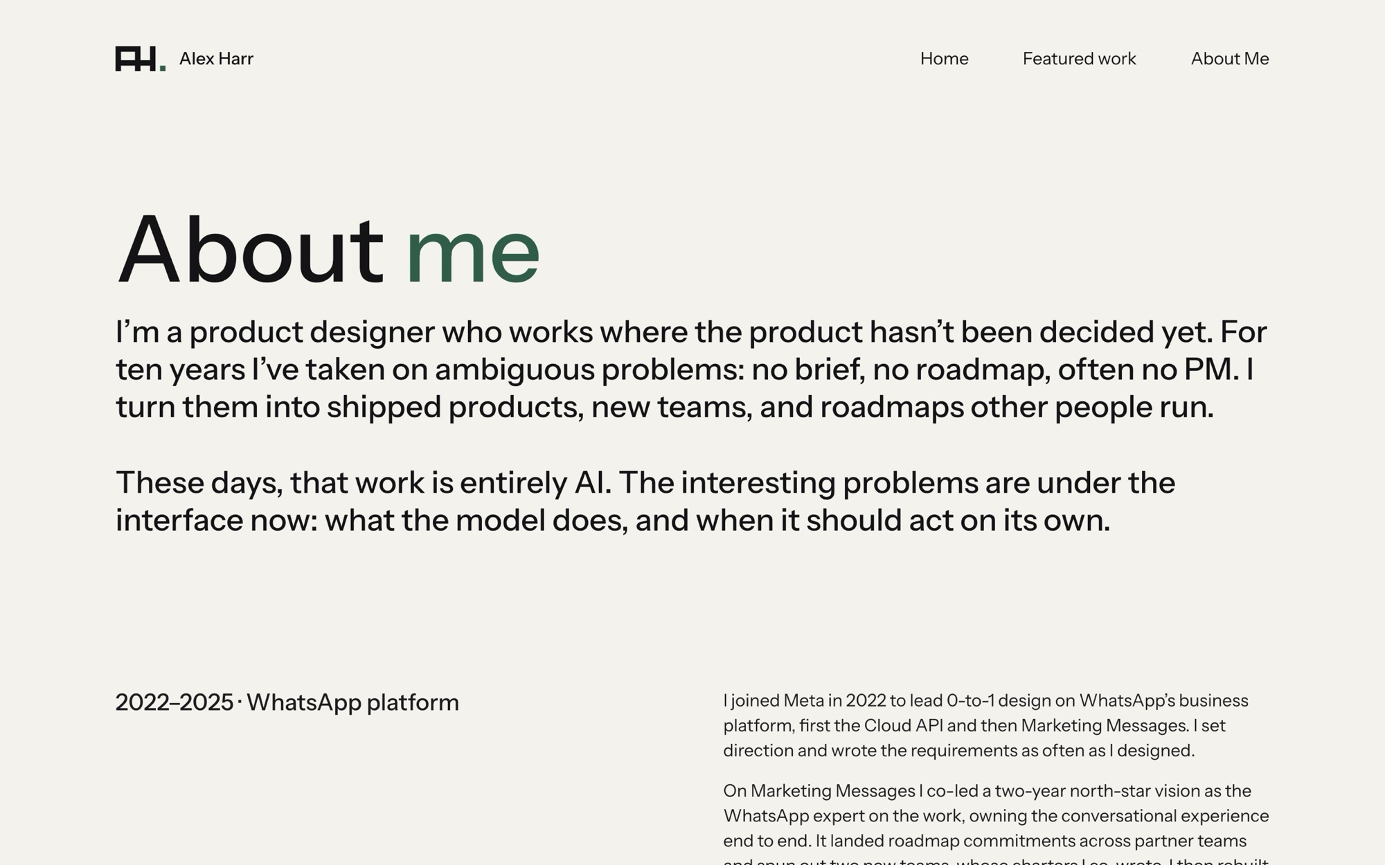
That week I also got a logo. I had the AI write the prompt for Claude Design, then interview me about what I wanted (“I kind of like the mongram but its weaved into like an icon”). The file came back carrying about 13KB of hidden metadata wrapped around 300 bytes of actual artwork, so the AI redrew the mark as a handful of rectangles, and it went live about 80 minutes after the first prompt. The smallest version of it is 113 bytes.
I also asked for a proper contact form, got interviewed about servers and spam, and said “actually just add my email to the footer.” Scope creep, meet scope cut.
The redesign I walked away from
Two weeks after launch, I designed a completely new look: paper colours, oxblood, serif type, the whole site laid out as a book in five chapters. The AI built eight pages of it in about 38 minutes.
Building it turned up two surprises. The scroll animations on my live site had been dead the whole time, killed by the step that squeezes the code down for publishing and invisible on my laptop. (Remember that step. It comes back.) And the Book showed the headings of my protected chapters in public, so my own leak check would have refused to publish it anyway.
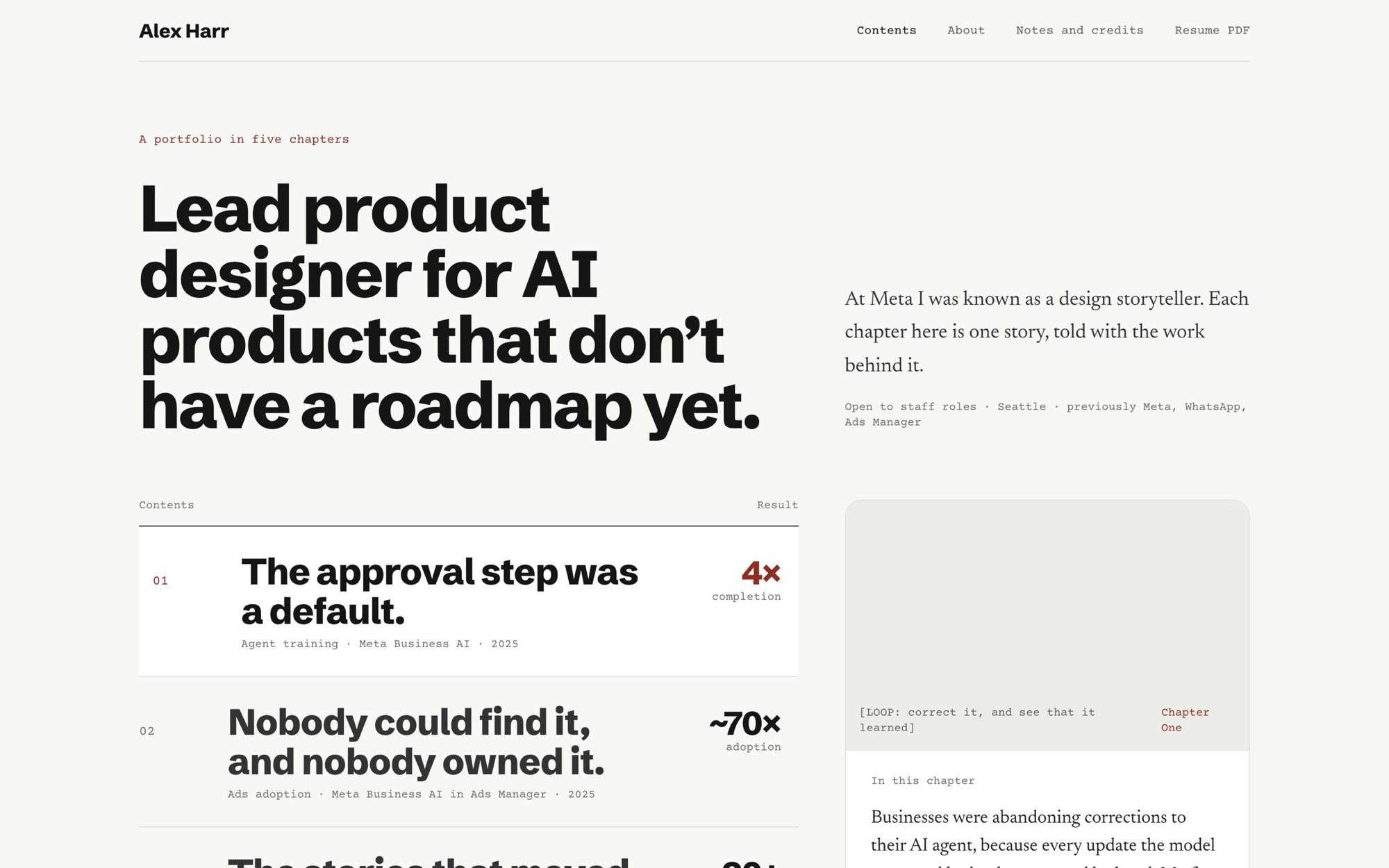
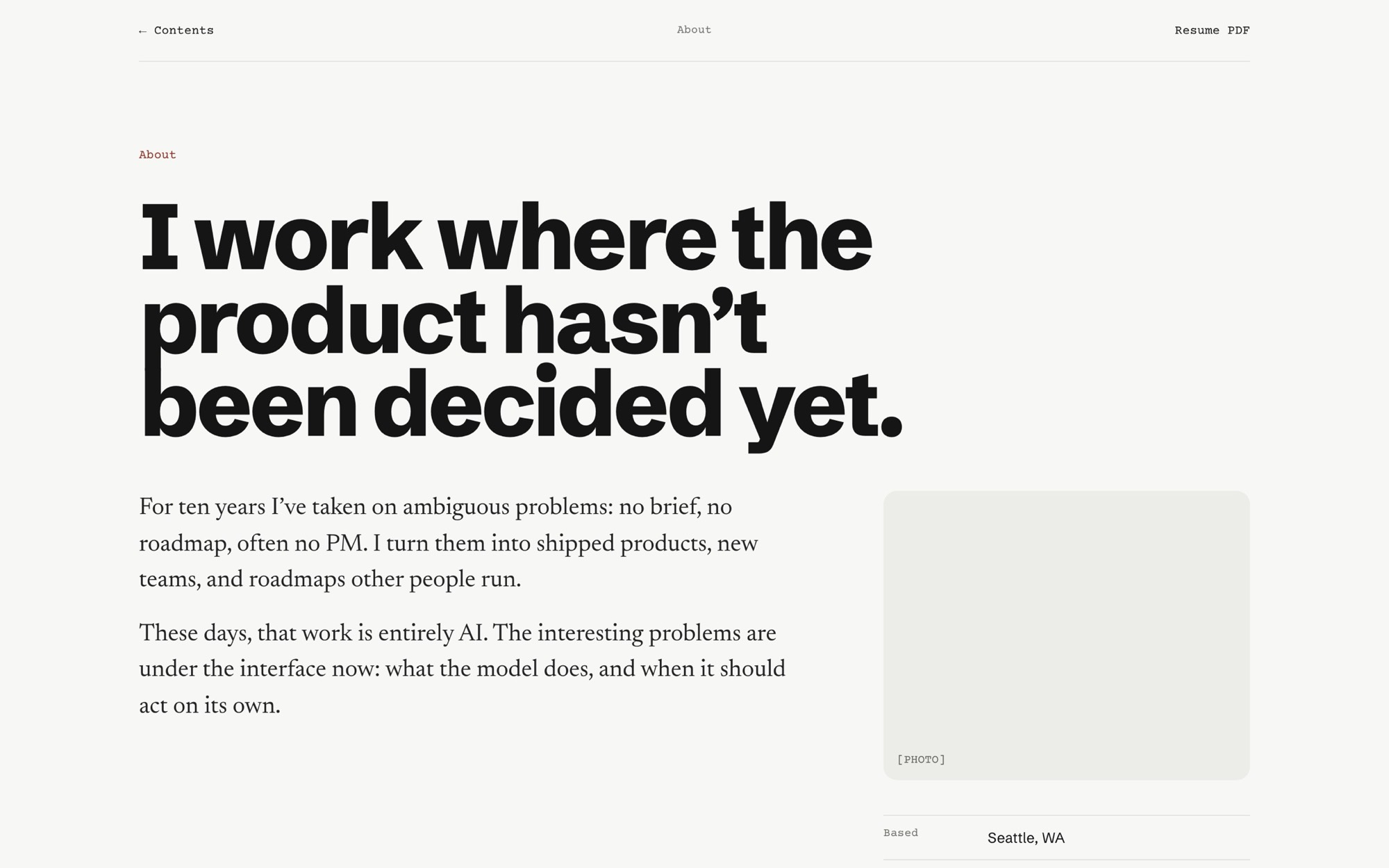
Then I walked away. It was boring, and it wasn’t me. It felt generic, and it didn’t say anything about me as a designer. When a whole redesign costs an afternoon, walking away from one is just a Tuesday. (September 15th was, in fact, a Tuesday.)
“I redid my website again”
While I was busy being bored by the Book, I was messing around in Claude Design and made a dot animation. That became the whole idea.
I work in AI, and AI is non-deterministic. Ask it the same thing twice and you get two different answers. So the dots start out scattered. But my specialty is creating order out of that, so when you scroll, the dots pull together into an ordered shape.
Here, have a go:
Six days after the Book, I came back with exactly that sentence, “I redid my website again,” and a proper design handoff out of Claude Design: a 253-line spec, three working prototypes, exactly 420 particles, exact colours, and a background that flips from dark to light as you scroll without ever pausing on the muddy middle grey where no text colour is legible enough.
It was built in about three and a half hours, and the AI earned its keep by pushing back wherever the prototype wouldn’t survive the real web. The prototype’s passcode screen was exactly the blurry box I’d refused in August, so it swapped in the real lock. Reduced motion was missing, so it added it. And it broke my zero JavaScript rule on purpose, with a reason I couldn’t argue with: “The canvas field cannot be done in CSS.” You can’t Smart Animate 420 particles. I made my peace with it.
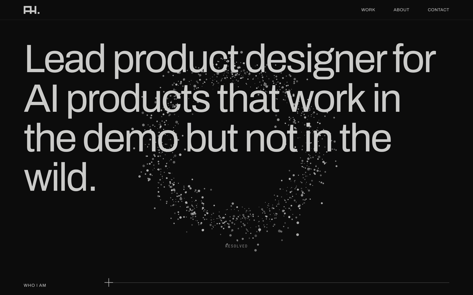 03 · Particles · Sep 22
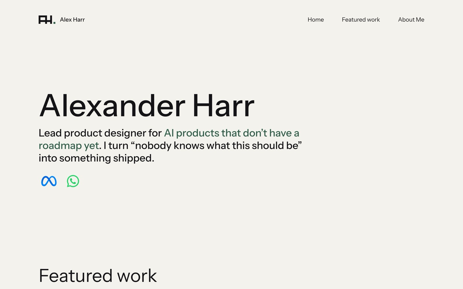 01 · First build · Aug 19
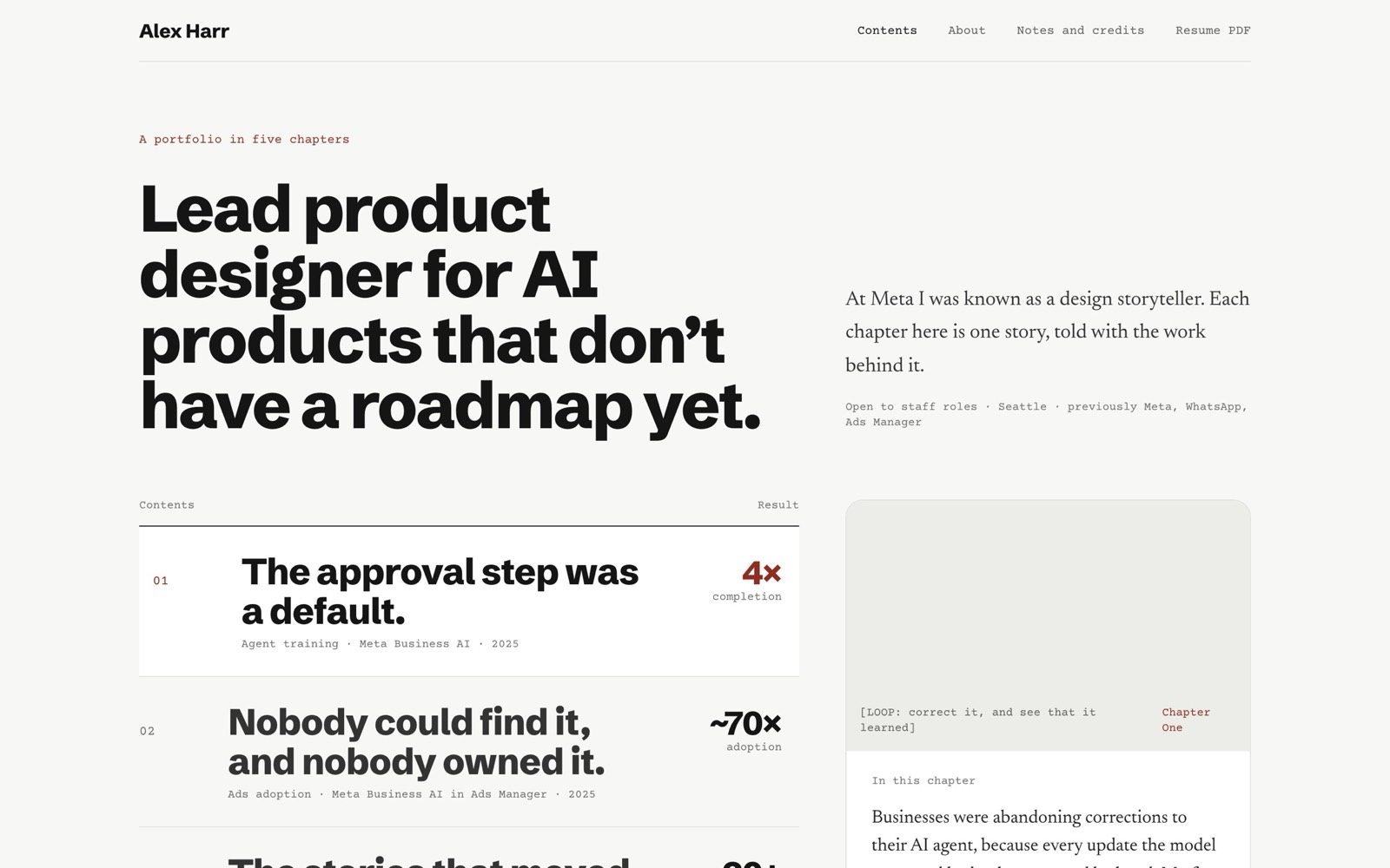 02 · The Book · Sep 15
“Think squarespace CMS editor”
Thirty-four minutes after I saw the new design running, I had a realisation: I was going to spend the rest of my life typing sentences into a chat box so an AI could paste them into files. So I asked for this:
We aren’t going to publish yet. I want an easy admin view where I can edit the text, add images etc. Think squarespace CMS editor.
And it built me one: fields on the left, my live page on the right, a save button. My own little Squarespace, living on my laptop and never published.
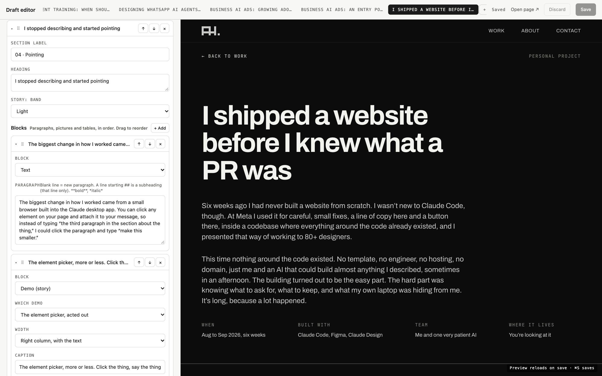
I never designed the editor. I used it, hit a wall, and named the wall:
For the work filters, I try to delete them and they aren’t being reflected
The built-in browser was quietly clicking No on every “Are you sure?” popup. Delete never worked. The popups are gone.
After saving text updates to the AI agent training card, the thumbnail reverted back
If I ask you in chat to make an update or make an update in the editor, it should save and the editor should show it
I want to be able to insert images here
I could add a setting: insert the picture after paragraph 3.
Why don’t we just do blocks. Like add a text block or an image block
The thumbnail one was the big one. The editor was holding an old copy of the page and quietly overwriting the AI’s chat edits every time I hit save, so now the editor watches the files and merges what changed. I can change a sentence in the editor while the AI changes another one in chat, and nobody’s work disappears.
The last line is the one that mattered. I did not want to count paragraphs; I wanted blocks, like Notion and every good editor ever made. That became how the About page and every case study are built, including this one. Then came bold and italic, drag to reorder, and uploads that convert my Mac screen recordings on their own. It was the most designer-y thing I did all project, and it fit in one line.
Wrong on purpose, until it was right
Once the editor existed, I stopped building a portfolio and started playing with one.
Dots
My About page portrait is made of tiny dots. I asked for a slider to change their size and was dragging it before the AI had finished testing it. It noticed, because the file had changed before its check was done: I’d already used the slider and saved.
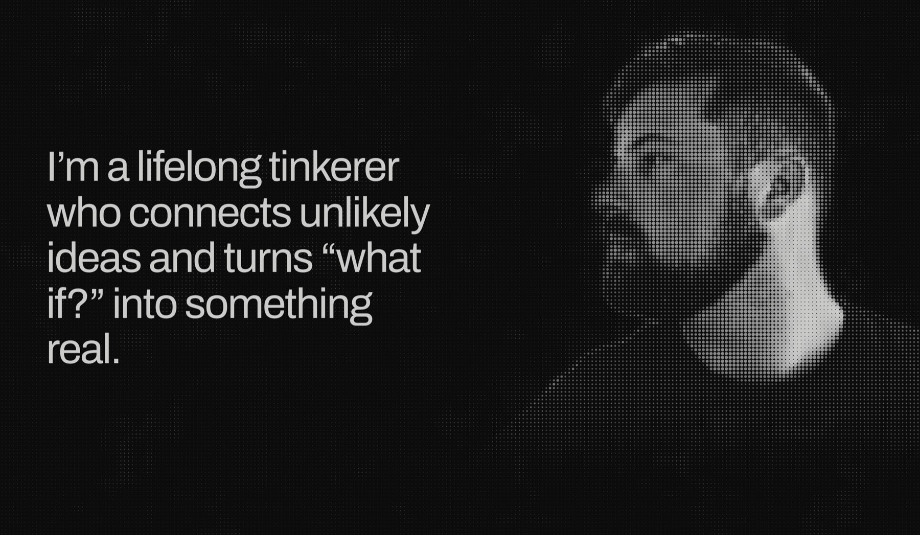
Then I argued with myself:
I want the dots to bleed into the below the portrait with the light background
Anyway to dark and white color blend more? Like a blended edge instead of a stark jump
Revert back with no blend
Then make the below the hero the dark background too
Four decisions, two of them undoing each other. That’s how I design, it turns out. I have to see it.
Changing my mind, professionally
That became the pattern. I asked whether a word could dim when a particle passed underneath it, got four live versions, tried the one where particles cut through the text, and said “I don’t like it, revert back.” I asked for logo hover ideas, picked option 3, and the next day said “Actually build 2.” Now the A in my logo swings open like a gate, which is completely unnecessary and extremely satisfying.
On the Ads case study a spotlight searches a screenshot before it settles. I asked for it squarer, saw it, and then asked for it to start round and turn square. Designing is being wrong on purpose until you’re right.
The footer
I wrote a 741-word brief for this one: “Do NOT make this look like a SaaS footer.” “One great interaction is better than five effects.” When you reach the bottom I wanted you to think of course this is how this site ends. Then my notes got short. “This footer is huge.” “I don’t see the wave pulsing at the bottom.” That last one was a real bug. The AI had reported the wave as working, but browsers pause animations nobody can see, and its browser window was hidden, so it had never seen the wave at all.
The typed conversation
The cover of my agent training case study is a chat that types itself out, letter by letter. My brief said “no springs.” By the time I asked for another round of interview questions, the AI had already built the whole thing, and admitted it. So I designed the pieces in Figma and handed them over, and it animated them in code, with a script that writes out the motion for every letter. Then I asked for springs, and it pointed out, correctly, that I’d just contradicted my own brief. It measured one grey chat bubble at 1.1 to 1 contrast against the background, which is a polite way of saying invisible, and I picked the fix that took it to 2.1 to 1. Last note: “the spring effect is a bit too much... Tighten it up.” The finished cover is 192 tiny letter animations, and because the script does its work before the page is published, your browser runs zero JavaScript to play them. I find that hilarious.
Launch #2, and the robot that checked my work
By launch day the playing had spread to four chats at once, all in the same project: the spotlight, the typed conversation, the WhatsApp components and some header fixes. It mostly worked. A chat I’d abandoned left behind a second copy of a component another chat had built, and the commits had to be untangled piece by piece, which is roughly what four chefs in one small kitchen looks like.
Then, on September 29th, I told the AI the thing it hadn’t assumed:
This whole particle-redesign is basically a new design which will change my live site.
It had been treating the redesign as a preview that would sit beside the old site. “That changes the job,” it said, and came back with a nine-step plan. Before we swapped anything, it bookmarked the old site so I could get it back in one step, shrank the published site from 111MB to 43MB, and planted five fresh leaks to prove the checker still caught them. It caught all five. I typed “push,” and about thirty seconds later the new site was live.
I switched analytics back on, and it broke again, obviously. This time its reports were going to an address on my own domain that nobody had predicted, and it took two tries to fix. The AI’s explanation: “I only found that by watching it fail live.” I’m choosing to find that charming.
Then I did the thing I’m proudest of. I wrote a brief for a QA agent:
You are a senior QA engineer with a product designer’s eye. Your job is to audit alexharr.com for visual bugs, interaction bugs, responsive and mobile bugs, and design-quality bugs, then produce a prioritized, evidence-backed bug list.
The reader is a recruiter skimming on their phone.
It installed its own browsers, wrote 19 test scripts and tested eleven screen sizes, from tiny phones to huge monitors, in three browser engines, then ranked every bug so another AI could fix them top to bottom. It even checked for em dashes, because I wrote the brief.
It found fifteen bugs, and not one of them showed up on my laptop.
- The frosted glass on my nav bar had never shipped to Chrome or Firefox. It was the same code-squeezing step that killed my scroll animations two weeks earlier, and it had been letting text scroll straight through the menu on every page.
- Headings that stick to the top of the screen were sliding under the nav and getting cut in half.
- On a phone, my particle ring sat right on top of the “Who I am” text.

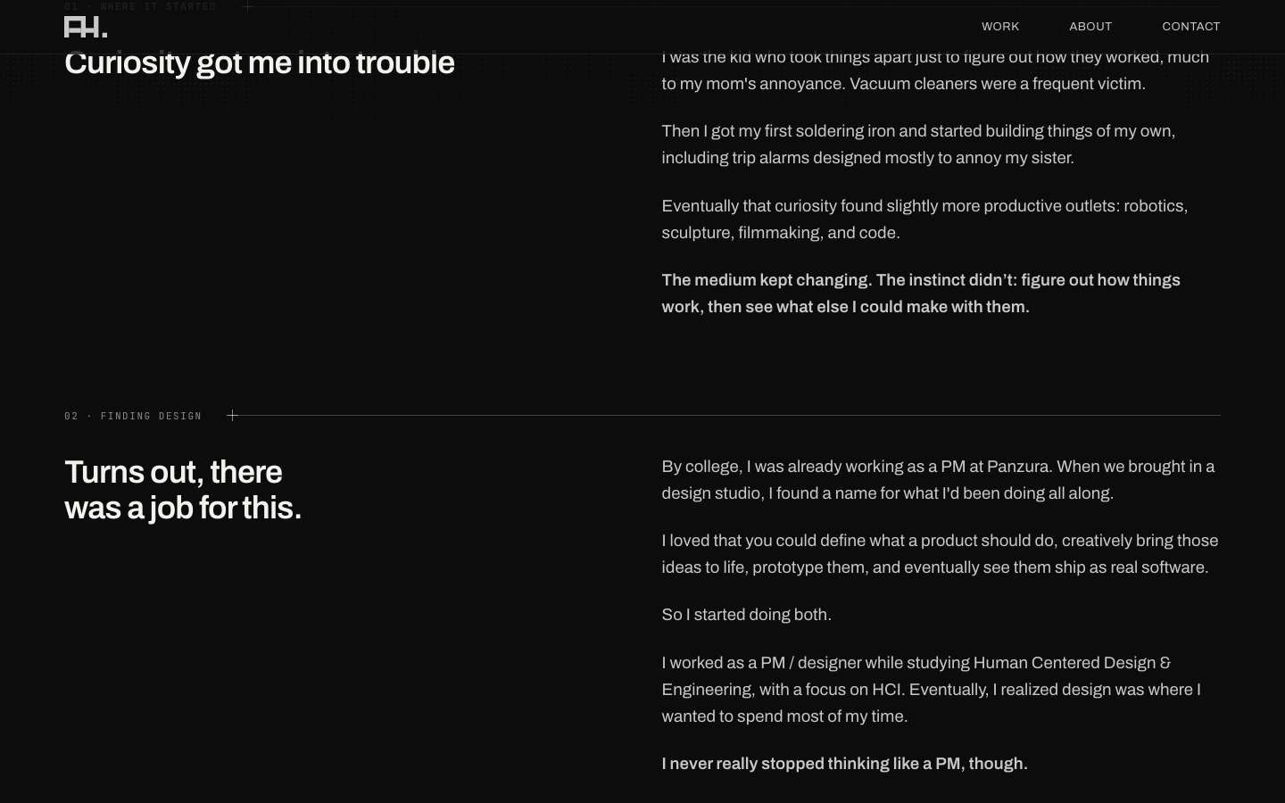
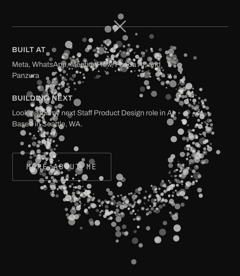
fix the P1s then do the P2s besides the case study titles
They were fixed, rechecked with the same scripts and live the same night.
If you want to try this
Here’s what I’d tell another designer:
- Write down how you want to work together. Mine says I’m a designer, be blunt, and ask before changing anything. The AI reads it every time.
- Ask “what would you recommend?” before “do it.” You’ll learn more, and it can’t flip fourteen sections on you.
- Point, don’t describe. Click the thing and say what’s wrong with it.
- Say “revert” a lot. Seeing it is the only way I know if I like it.
- Ask it to write your prompts. Some of my best briefs were written by one chat and run by another.
- Get a second pair of eyes that isn’t your laptop. Your machine is lying to you. Mine was hiding fifteen bugs.
- Build the weird unnecessary thing. The gate logo is my favourite thing on the site.
So, what did we make?
In six weeks, 42 chats and about 430 prompts, we made:
- a portfolio I designed three times and shipped twice
- real encryption on three case studies, and a checker that won’t let me leak them
- a book-shaped redesign that lives on in a branch somewhere
- a little Squarespace on my laptop
- a QA robot
- a logo that opens like a gate
I still sort of don’t know what a PR is.